
Welcome 2022, and Pantone's Color of The Year!
Pantone recently unveiled the new “Color of the Year” for 2022.
And it truly is a new color; Very Peri (PANTONE 17-3938) is a color created by Pantone for first time in the history of the Pantone Color of the Year educational color program.
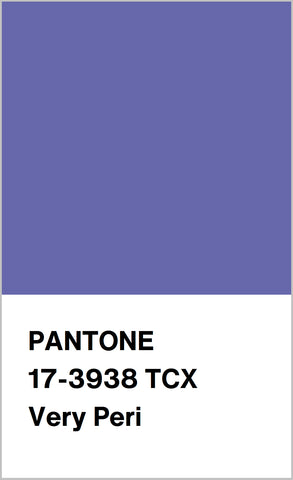 Pantone's brand new color, "Very Peri (17-3938)"
Very Peri blend blues and violets together, with an underlying splash of red in the mix. The name is based off of the color periwinkle, a pastel, calming and soft color.
“Periwinkle” is derived from the myrtle plant (Vinca Minor), whose flowers are often called ‘periwinkle’. It was first seen in written form as a color name in 1922.
Pantone describes the color as spritely, with a joyous attitude and dynamic presence that encourages courageous creativity and imaginative expression.
Now, more then ever, as the world moves into 2022, we are all looking for new ways of expressing ourselves. We could all use a boost of courage and creativity as we continue to move forward.
Very Peri melds the calming stability of blue, the intriguing mystique of violet and the bold strength of red into a pleasing, soft color.
Not only are all these colors on their own popular and lovely, but they have been historically difficult to reproduce for paints and dyes in ages past.

The color strikes a chord as something different, something fascinating, something almost magical. With how digital and physical worlds have shifted and merged recently, its’ fitting that the color of 2022 would also be a fusion of multiple hues in one.
The periwinkle color isn’t readily found in nature every day, but the jewelry world is certainly brimming with options for sparkling jewels to match this brand-new color.
Tanzanite might spring to mind first; Very Peri is almost the spitting image of the blue-violet member of the zoisite family.
But this comparison isn’t only facet deep.

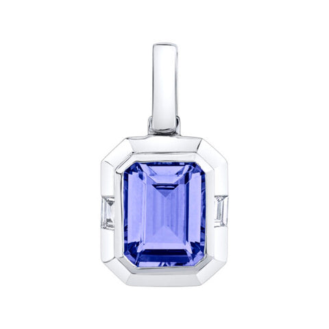
Tanzanite earrings and pendant by Stanton Color
Tanzanite is trichroic, meaning it in fact shows three different hues from different crystal directions. Usually, our human eye can only see two of those colors, blue and violet. However, you may see a flash of red in very fine stones under the right conditions.
Or, if you use a gemological tool know as a dichroscope, you will be able to see the three colors split completely.
Violet, blue and red.
Even though we usually see with our unaided human eyes the blue-violet, there is something a little off about Tanzanite due to that red undertone. Place a fine tanzanite and a fine sapphire next to each other and even if they have a similar hue composition, there is something different about them.
Very Peri seems made to match tanzanite not just in color, but perhaps in meaning as well.


Tanzanite and diamond rings in yellow gold by Stanton Color
Many suggest that tanzanite has a very high energy and vibration, leading to opening the mind to new ideas while clearing the old, and helping with communication. It is also considered a stone that promotes higher thinking, as well as bringing the mind and body into sync.
Another stone that encompasses Very Peri’s color and meaning is blue chalcedony. Chalcedony is a cryptocrystalline member of the quartz family, and comes in a wide range of colors. Adjacent to other cryptocrystalline quartz like agate and jasper, chalcedony has been seen throughout history as a stone used as jewelry, carvings, seals, tools and talismans since at least 1800 BC.


Chalcedony stones showcasing the "Very Peri" color.
The blue variety can range in saturation from a pale periwinkle to a darker gray-blue. It can show banding or variations of coloring in a single stone.
Lighter chalcedony stones mimic Very Peri quite well, and provide a more ethereal choice then transparent tanzanite.
Blue chalcedony is said to also open the mind to new ideas, while being credited as a good stone for reflection. In Roman times it gained a trait of being useful for public speaking and for helping with stage fright. This belief has carried forward, with chalcedony still being seen as a stone to help with words and also treat throat discomfort.
Chalcedony and gold earrings by Lika Behar
The soft, gentle tone of blue chalcedony reflects the calming side of Very Peri perfectly.
Sapphires in the pastel ranges can also showcase a close match to the color of the year.
While sapphires can come in almost every hue, with varying intensities, pastel sapphires have been gaining popularity in jewelry over the last few years.


Geometric inspired pastel sapphire pieces by Parle.
Commonly seen in more green-blue colors, some sapphires can display a lovely violet and blue combo that highlights periwinkle. Mix the unusual lighter colors with sapphire’s stories histories and brilliant durability, and you have a very pretty option indeed.
Sapphires are known for being a stone of loyalty and peace, providing the wearer with a calming atmosphere. It has also been said to help with speaking, new ideas and general good luck.
Called a stone of the heavens, the stone has been considered holy and blessed by many cultures throughout history.

Matching set of jewelry featuring pastel sapphires by Parle.
The pastel variations of sapphire are truly unique and intriguing, providing something a little diverse and uncommon.
There are many gemstones that would play off the violet, or blue, or red pieces of Very Peri, but there are some gems that just seem to be the perfect match.
As we move into a new year, may we continue to not only look forward, but move forward as well.
The old has gone, the new has come.
With Very Peri as the first glimmer of inspiration for 2022, let’s enter the new year with courage, creativity and curiosity.

~Blog by Isabelle Corvin, Staff Gemologist and Merchandising Manager
This blog was featured by the American Gem Society! Welcome Pantone's Color of The Year: Very Peri - American Gem Society